
June 16, 2026
Exhibition & Promotional Displays: How to Build a Professional Event Setup
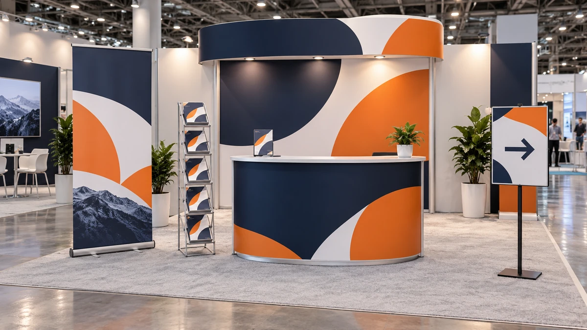
A professional exhibition setup is not a collection of unrelated printed items. It is a coordinated space that helps someone notice the brand, understand the offer, enter the stand and start a conversation. Every banner, counter, brochure and sign should have a defined job.
Planning the visitor journey before ordering makes the display clearer and the hardware easier to reuse. Begin with one message, then select portable products from Ellesi’s current Display Stands, event and large-format ranges to support it.
1. Start with the main brand message
Decide what a visitor should understand from the aisle. The logo identifies the exhibitor, a short headline explains the main benefit, and one supporting visual creates recognition. Product details and longer explanations can wait until the person steps into the stand.
Build a small visual system before designing individual items:
- approved logo versions and clear space;
- one primary headline;
- brand colours with reliable contrast;
- a consistent type hierarchy;
- one style of photographs or illustrations; and
- a shared call to action.
Design the booth as a whole. If every surface shouts a different message, visitors have no clear starting point.
2. Create visibility from a distance
Height and simplicity create aisle visibility. A full-height pull-up banner can identify the stand above furniture and people without requiring wall installation. Ellesi’s Deluxe Pull Up Banner uses an 850 × 2000 mm visible graphic with a heavier premium cassette, tool-free setup and carry bag. The Econo model uses the same visible graphic size in a lighter economy cassette.
An X banner is another portable choice, using a visible rear tension frame and eyeleted PVC graphic. Custom PVC banners can create wider messages where the venue provides an appropriate support and permits the planned fixing. Compare the options in Banners & Large Format.
Large graphics should carry fewer words, not more. Keep the logo and headline high enough to remain visible when people stand at the counter. Avoid placing essential details at floor level or along an edge that may be hidden by hardware.
3. Build the customer interaction area
A counter gives staff a clear position for greeting visitors, demonstrating a product or collecting registration details. The ABS Promo Counter has a curved branded front, raised header, moulded top and base, and carry bag. Its main print area is 1830 × 870 mm, with the product recommending that essential information stay near the central area because the outer graphic wraps around the sides.
The Kidney Shaped Promo Counter provides a curved working surface and a 1845 × 930 mm printed wrap. It is useful for launches, registrations, demonstrations and retail activations. With any counter, keep the top organised; piles of boxes and personal items quickly undermine the presentation.
Printed literature should be visible without covering the counter. The A4 Brochure Stand with 6 Pockets uses a foldable zig-zag frame and compact footprint. Load literature evenly and choose only the brochures relevant to that event.
A small tabletop sign can support a price, QR code or next step if the destination is tested and the code remains large enough to scan. Do not make a QR code the only explanation; pair it with a short description of what the visitor will receive.
4. Guide visitors around the space
Directional and information signs reduce uncertainty. A welcome board can identify the activation, while arrows can guide people towards registration, demonstrations or meeting areas. Product-category signs help visitors understand a larger range without waiting for staff.
The live Event Signs category includes current options for corporate and social-event display. Rigid boards can be placed on compatible easels or sign stands; do not assume one support holds every board weight or size.
Use the same arrow style, terminology and colour across the stand. “Register”, “Book a demo” and “Scan for the guide” are clearer than vague labels. Position directions before the point where a visitor needs to decide.
5. Choose portable components deliberately
Portability includes more than product weight. Ask how many cases there are, whether the hardware fits in the vehicle, how long setup takes and whether one person can assemble it. Carry bags protect components only when everything is packed correctly.
Retractable banners store their graphics inside the cassette. X banners separate into a frame and eyeleted graphic. Promo counters dismantle for transport, and the brochure stand folds into its supplied case. Keep a labelled packing list and photograph the complete kit before leaving the office.
Reusable hardware is most valuable when future graphics can be planned for it. Confirm replacement-graphic availability for the exact model. Avoid printing one-off dates directly into every reusable element when a smaller replaceable panel could carry event-specific information.
6. Keep every branded element consistent
The banner may be seen from ten metres, the counter from two metres and a brochure at arm’s length. They need different amounts of detail but should clearly belong to one identity.
Repeat the same logo treatment, headline tone, colours and image style. Use vinyl graphics or stickers for selected surfaces only when the material and application are appropriate. A novelty presentation item can support an award or prize activation, but it should connect to the event objective rather than appear as decoration.
| Display type | Best for | Portable? | Typical use |
|---|---|---|---|
| Pull-up banner | Distance visibility | Yes, retractable with bag | Brand or campaign message |
| X banner | Lightweight graphic | Yes, frame and bag | Temporary promotions |
| Promo counter | Staff interaction | Yes, dismantles | Registration and demonstrations |
| Brochure stand | Organised literature | Yes, folds into case | Catalogues and takeaways |
| Rigid event sign | Welcome or directions | Depends on board and stand | Wayfinding and information |
7. Plan artwork and production early
Choose each product and size before designing. Set artwork to the correct proportions, use vector logos where possible and check image resolution at final output size. Bleed, safe areas and finishing allowances vary by product; follow the selected item’s artwork notes.
Proof names, dates, URLs, telephone numbers, stand numbers and arrows. Test QR destinations on more than one phone. Export the production file using the requested format and reopen it separately to confirm that fonts, images and effects display correctly.
Schedule a dry run before the event. Assemble the hardware, install the graphics, load the brochures and photograph the setup. A rehearsal reveals missing poles, unstable floor positions and hidden copy while there is still time to respond.
Frequently asked questions
What is the minimum useful exhibition setup?
A clear portable banner, an organised interaction point and a simple next step can be enough. Add counters, literature and directions only when each item supports the visitor journey.
Should every display contain the same wording?
No. They should share one identity, but each has a different viewing distance and purpose. Use the banner for recognition, the counter for engagement and literature for detail.
Can Ellesi supply a completely custom setup?
Use the quote route for requirements outside the configured live products. Provide the floor plan, event date, transport constraints, required components and artwork status.
Build the setup around one message and one visitor journey. Plan your exhibition display with a custom quote.