
September 24, 2024
A Guide to Shop Front Signs for South African Businesses
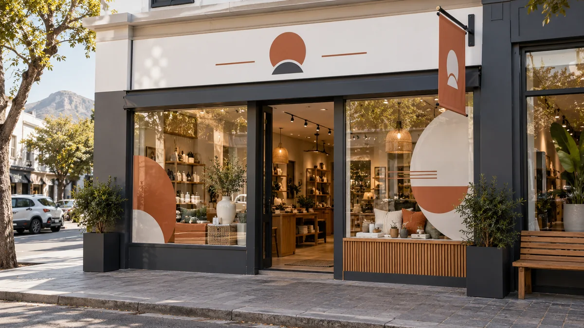
A shop front sign has to identify the business, support the brand and work with the building—not fight it. The most appropriate format depends on the available fascia, viewing angle, trading hours, landlord requirements and the level of finish your customers expect. South African sun, wind and seasonal rain also make material and installation choices important.
Start with the shop front, not a sign catalogue
Measure the usable fascia and photograph the entire frontage from across the street and from both approach directions. Include awnings, shutters, windows, columns, lights and neighbouring signs. Those elements determine where a message can sit and whether a panel, individual letters or window graphics will read clearly.
Decide what the main sign must communicate. In most cases the business name or logo deserves the strongest position. A short descriptor can help an unfamiliar brand, but a long service list is better placed on a window, wall panel or secondary sign. Keep opening hours and detailed contact information close to pedestrian eye level.
Flat panels: Chromadeck and ACM
Chromadeck is a practical coated-steel option for a full-colour shop sign. It suits businesses that need a broad branded panel with a clean printed face. Ellesi’s Chromadeck Shop Front Sign uses 0.6 mm material and offers a plain sheet, a rear steel frame, or a steel frame with aluminium angle edging. The appropriate construction depends on size and the mounting surface.
ACM creates a rigid, smooth panel at relatively low weight and can give a fascia a crisp premium finish. It is useful where flatness and clean edges matter. Chromadeck and ACM are not identical: one has a coated-steel face, while the other is a layered aluminium-composite panel. Weight, support and edge treatment should be considered with the installer.
Flat panels provide a large area for colour and photography, but they can look visually heavy if the panel proportions ignore the building. A carefully sized sign with generous spacing usually appears more professional than one filled from edge to edge.
Acrylic, cut-out letters and 3D lettering
Acrylic signs work well for polished plaques, logos and architectural details. Clear, white, black or frosted surfaces can be fitted with standoffs to create separation from the wall. Acrylic is especially effective around entrances and reception areas where customers view the sign at close range.
Cut-out or built-up letters remove the rectangular panel background and let the façade become part of the design. Flat letters provide a clean silhouette. Three-dimensional letters add depth and natural shadow, making a shop name more visible from an angle. These formats need accurate layout, spacing and installation; poor alignment is much more noticeable than it is on a single printed panel.
Do not treat every option as equivalent. A broad Chromadeck panel is effective for full-colour information and strong value. Acrylic is better suited to a refined plaque or layered brand feature. Dimensional letters are chosen for architectural presence and depth, not for carrying paragraphs of text.
Banners and window graphics
Banners are useful for opening campaigns, seasonal offers, renovations and temporary messages. They are flexible and economical, but they should not be expected to create the same permanent architectural finish as a rigid panel or dimensional lettering. Browse Banners and Large Format for current printed banner formats.
Windows offer valuable space without covering the fascia. Printed vinyl can carry opening hours, services or promotional graphics. Frosted and decorative window films can add privacy while keeping the storefront visually consistent. Preserve useful sightlines into the shop and avoid covering so much glass that the entrance feels closed.
When illuminated signage is worth considering
Illumination helps businesses that trade after dark or sit in a poorly lit retail environment. Lighting can come from within a sign, behind individual letters or from external fittings. An illuminated sign should still work as a clear design during the day; light cannot rescue weak contrast or overcrowded copy.
Ellesi’s LED Backlit Acrylic Signs provide one current route for illuminated acrylic presentation. Electrical supply, cable routing, weather protection, access for maintenance and landlord approval all need to be planned before manufacture.
Build a coordinated storefront
A good shop front often uses a small system rather than one sign trying to do everything:
- a main fascia sign for identification;
- entrance or window information at pedestrian level;
- a temporary banner or poster area for changing offers;
- directional information where parking or access is not obvious; and
- appropriate lighting for the hours of operation.
Use consistent colours, typefaces and spacing across these elements. Ask for an elevation or mock-up on a photograph of the actual shop front so scale can be assessed before production. Confirm spelling, contact details and final dimensions, and make sure the mounting surface is sound.
Planning a new storefront or replacing mismatched signs? Send Ellesi a straight-on photograph, fascia measurements and your logo when you request a custom quote. The team can help match the format to the building and your budget.