
April 9, 2025
What Size Sign Do You Need? A Practical Signage Size Guide
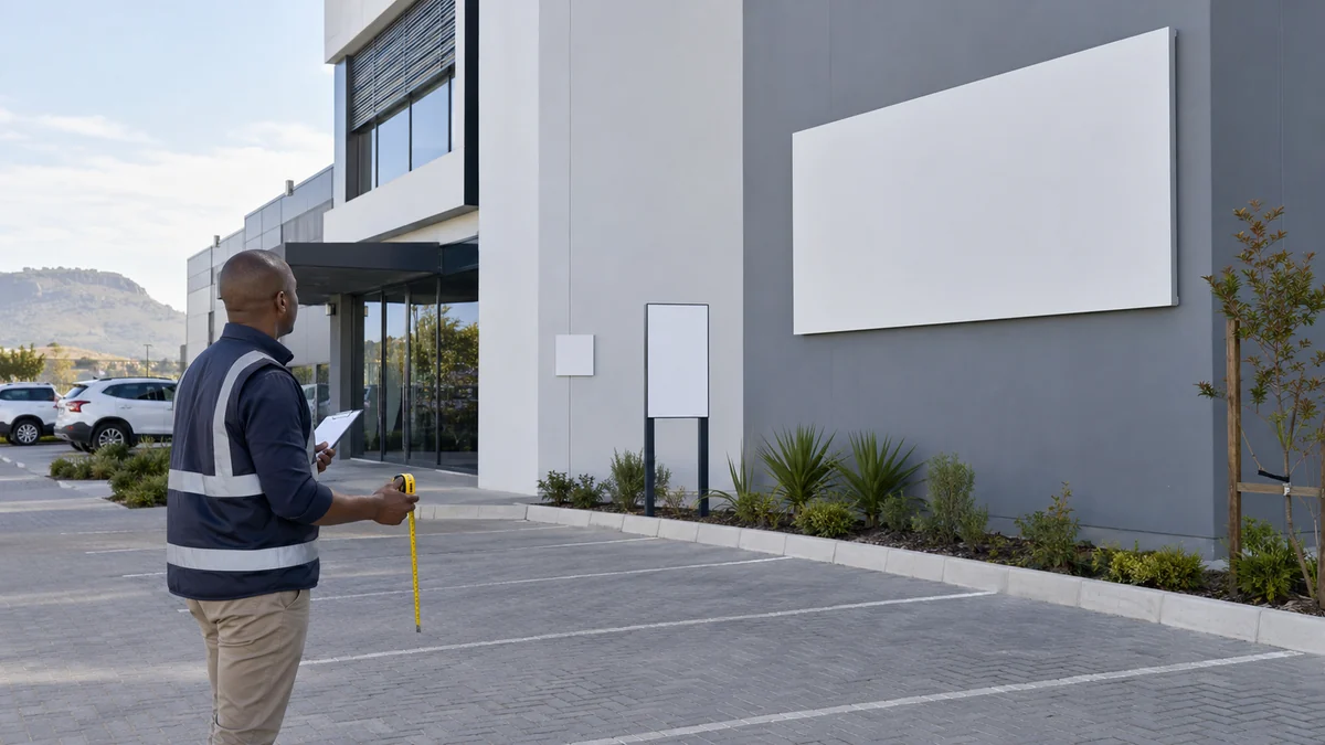
A sign should be large enough to read in its real setting, but size alone does not create clarity. Viewing distance, message length, letter height, contrast, mounting height and the speed of the viewer all work together. This practical sign size guide helps you frame the decision without treating a convenient rule of thumb as a legal standard.
Four questions determine a useful sign size
- How far away is the viewer? A reception notice read from one metre can carry smaller detail than a wall sign seen across a parking area.
- Is the viewer moving? Drivers and people walking past have less time than someone standing at a counter.
- How much must the sign say? More words require either a larger sign or smaller text. Usually the better answer is to shorten the message.
- Where can it be mounted? The available wall, fence, post or stand sets real limits on dimensions and orientation.
Measure the site and take a photograph from the main viewing position. Mark the proposed outline with removable tape if possible. This simple mock-up shows whether the sign feels lost, overcrowded or blocked before artwork begins.
Small notices and close-view signs
Door labels, reception instructions, office names and counter notices are normally read by pedestrians at close range. Compact A4- or A3-type formats may be sufficient when the message is short and the sign is placed near eye level. These familiar paper proportions are useful starting points, not mandatory sizes.
Keep the wording direct. A small sign with a strong heading and one instruction is more useful than a dense paragraph. Acrylic plaques and snap frames suit polished indoor notices; a rigid printed panel may be better for entrances exposed to handling or weather.
Parking, access and safety signs
Parking and gate signs need to be understood before the driver reaches the decision point. Allow space for a clear symbol or heading, the essential instruction and, if needed, a directional arrow. Mount the sign where parked cars, open gates or vegetation will not hide it.
Ellesi’s standard-message Chromadeck products often use compact rectangular or square sizes suited to simple parking, access and safety instructions. For a custom layout, the Chromadeck Parking Sign offers several larger standard sizes as well as a custom-quote route.
Do not infer legal adequacy from a product’s dimensions alone. Where a regulated symbol, traffic application or workplace standard applies, confirm the required design, location and size with the appropriate competent person.
Wall signs and shop fronts
A business name on a façade is usually viewed from farther away than an entrance notice. Start with the measured fascia, then reserve clear space around the logo rather than filling every centimetre. A wide horizontal format often suits a shop fascia, while a square panel may work better on a side wall or pillar.
Ellesi’s Chromadeck Shop Front Sign currently offers standard options from compact square panels through broad horizontal formats, with custom sizes available. The variety is useful because two businesses with the same logo may need very different signs depending on the building and approach.
If customers pass in vehicles, simplify the copy to the business name, a short descriptor and perhaps one contact route. Opening hours and service lists are usually better placed on windows or a pedestrian-level secondary panel.
Construction boards and large outdoor signage
Construction and development boards may need to carry project information, several professional logos and contact details. That content quickly becomes unreadable on a small panel. Decide what must be visible from the road and what can be read by someone closer to the site entrance.
A Chromadeck Construction Site Sign can be ordered in broad standard formats or quoted to a custom size. Larger metal panels may need rear steel-frame support, careful packing and an installation designed for the site and wind exposure. The structural plan should be agreed before artwork is finalised.
Very large outdoor signage often works best as a hierarchy: a prominent project or business name, a short message and a separate detailed information area. Trying to enlarge every line equally wastes space and makes the viewer work harder.
Temporary and event boards
Correx is a practical lightweight choice for repeated directional boards, event notices and temporary campaigns. Ellesi’s printed Correx range includes A2 and A1 boards. A2 is convenient for close-view notices and smaller arrows; A1 gives more room for an event direction or promotional message. Orientation also matters—a landscape arrow board and portrait schedule use space differently.
For a welcome sign or seating chart, guest count and display distance affect size. A short welcome can work on a smaller portrait board, while a seating plan with many names needs more area and an organised layout. Make sure the chosen stand supports the board dimensions.
A practical pre-order test
- Print the artwork at a reduced scale and step back until the main heading becomes difficult to read.
- View a mock-up on a photograph of the actual location.
- Check the longest name, telephone number and arrow—not only the shortest sample copy.
- Confirm the final dimensions use the same width-to-height ratio as the artwork.
- Ask how the sign will be packed, transported, supported and installed.
There is no universal “correct” dimension for a business sign. The goal is a format that gives the necessary message enough space at the actual viewing distance while remaining practical to produce and install.
Unsure which standard size fits? Request a custom quote and include a site photograph, measurements, intended viewing distance and proposed wording so Ellesi can advise on a workable format.